Bunifu Button
Fully customizable buttons with icon support to visually represent button actions.
For new users and those migrating from a previous version, please note that you now won't need to set colors for the onHoverState and OnPressedState as the colors will be automatically generated for you whenever the property AutoGenerateColors is set to true. Also, the BorderRadius and BorderThickness will be applied based on the default values.
Bunifu Button is a highly flexible button control offering more than a dozen built-in design styles, giving you a strong creative starting point for building polished interfaces.
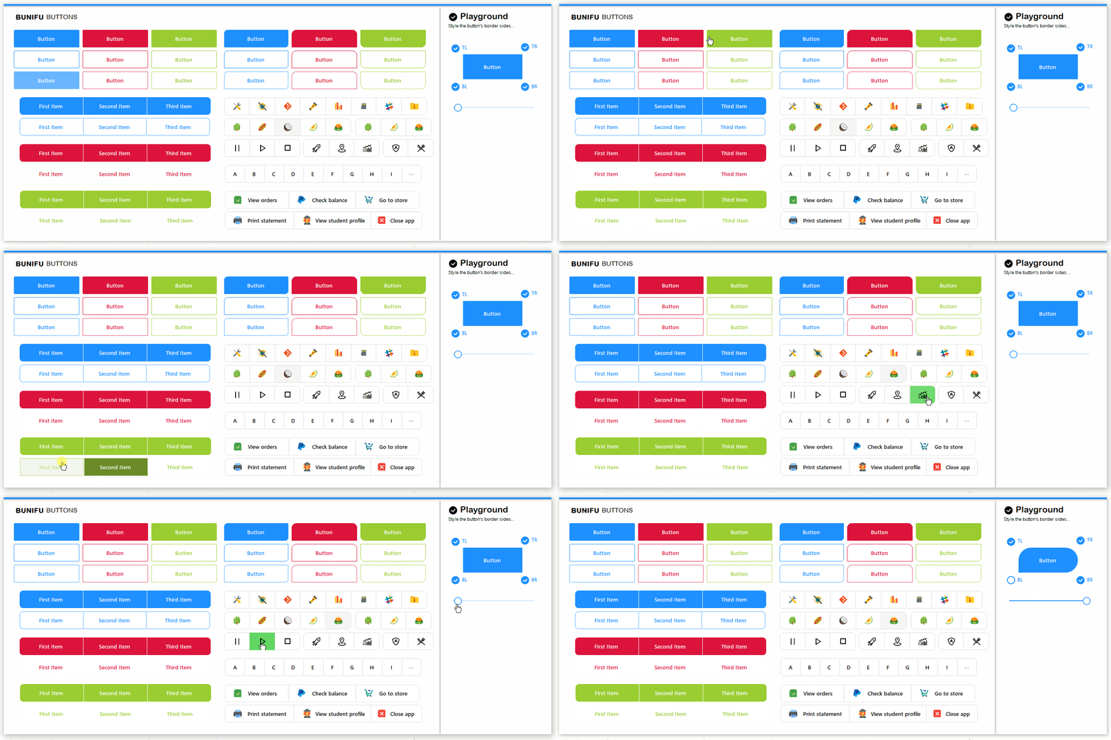
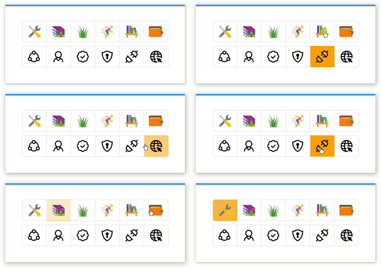
From subtle state animations and border styling to icon support, smooth curves, and overall visual polish, Bunifu Button covers a wide range of design needs.
Now, let's get straight into some of the best features included.

You can quickly adjust the button's most common properties by clicking the Play icon to open the Smart Tags panel:
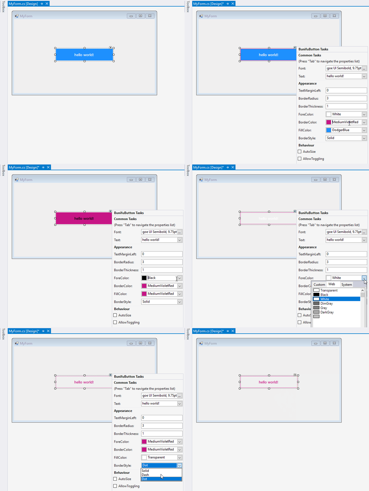
Animations
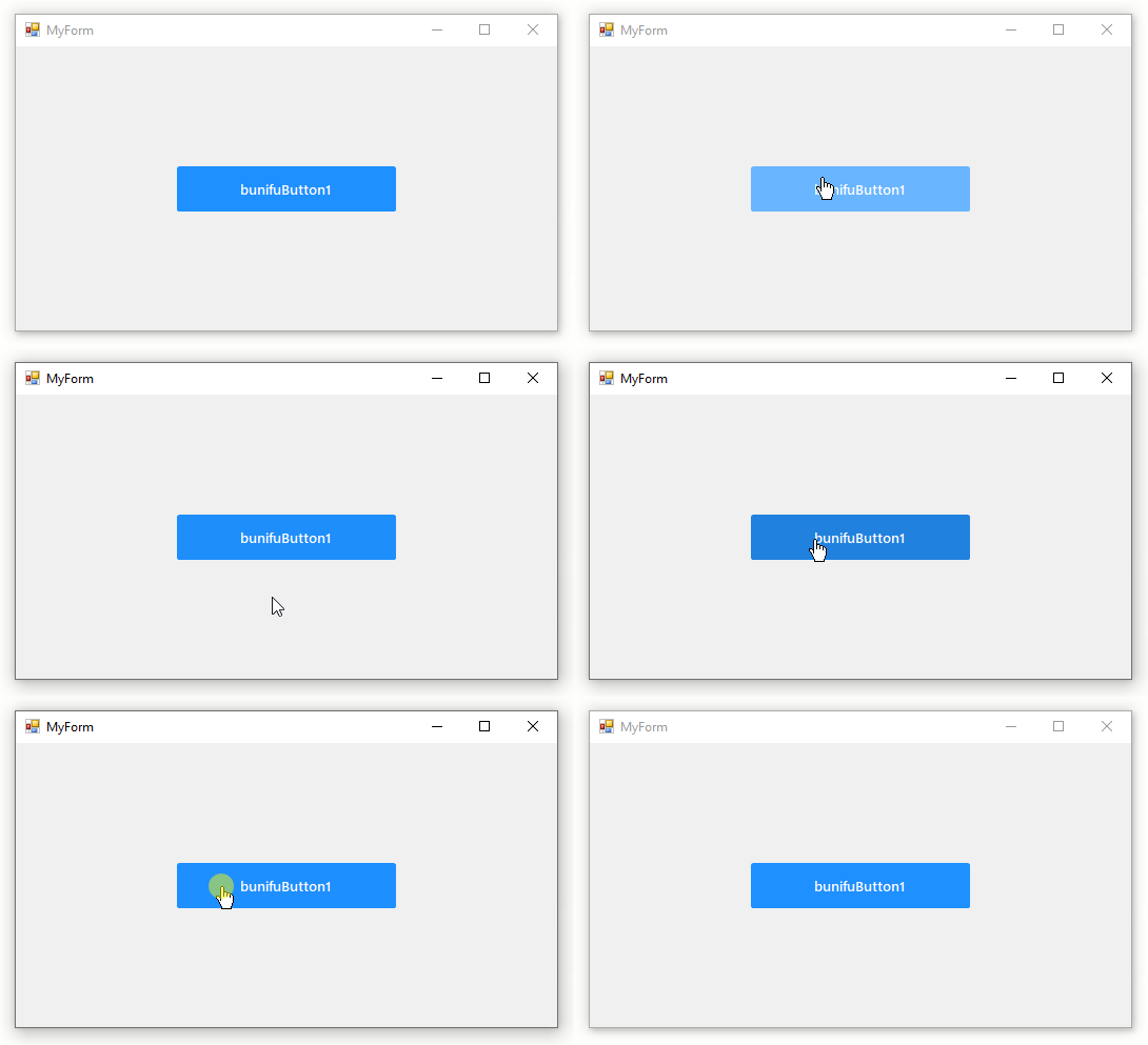
Bunifu Button includes built-in animated transitions between three states — Idle, Hover, and Pressed — represented by the properties OnIdleState, OnHoverState, and OnPressedState.
Here's an example showing all three states in action:
Border Style Options

The BorderStyle property offers three border variations: Solid, Dash, and Dot.
Solid:

Dashed:

Dotted:

These styles can also change dynamically between states — for instance, switching to Solid only when transitioning from idle to hover:
Edge Customizations
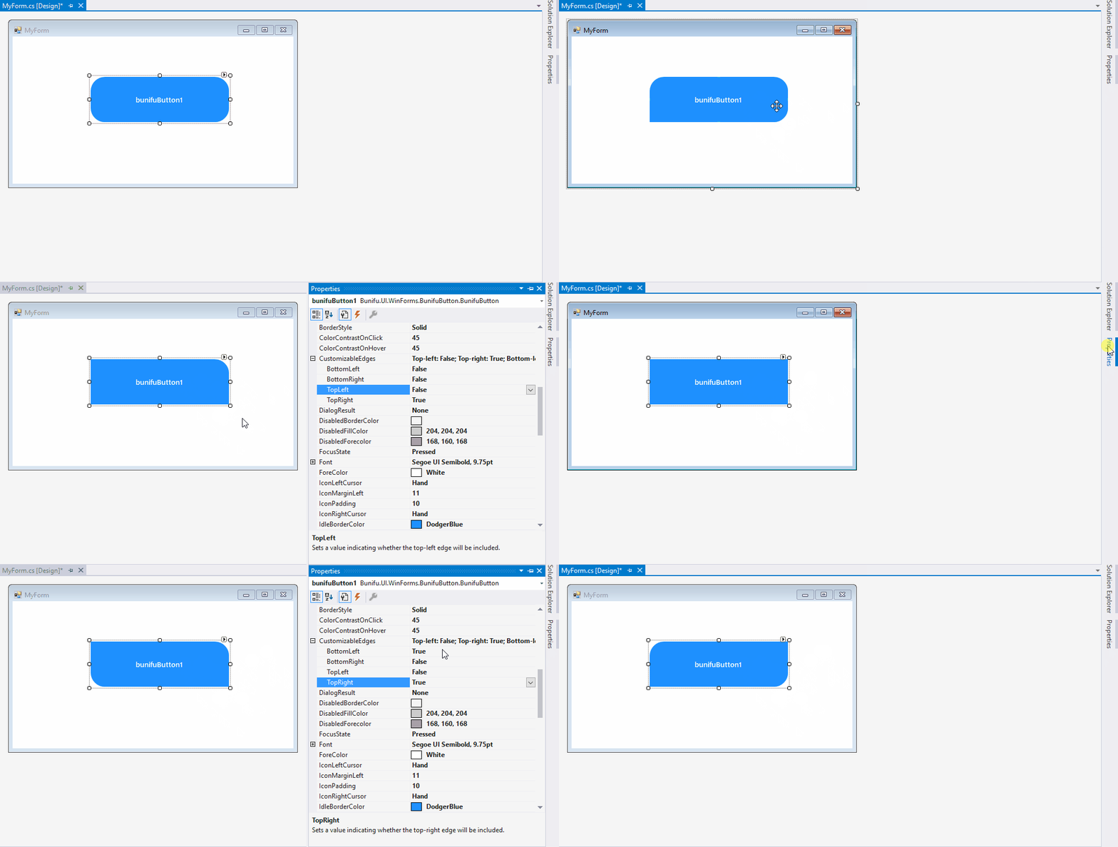
The CustomizableEdges property lets you choose exactly which corners are affected when applying border radius styling:

Your edge settings persist automatically across state changes at runtime:
Automatic Sizing
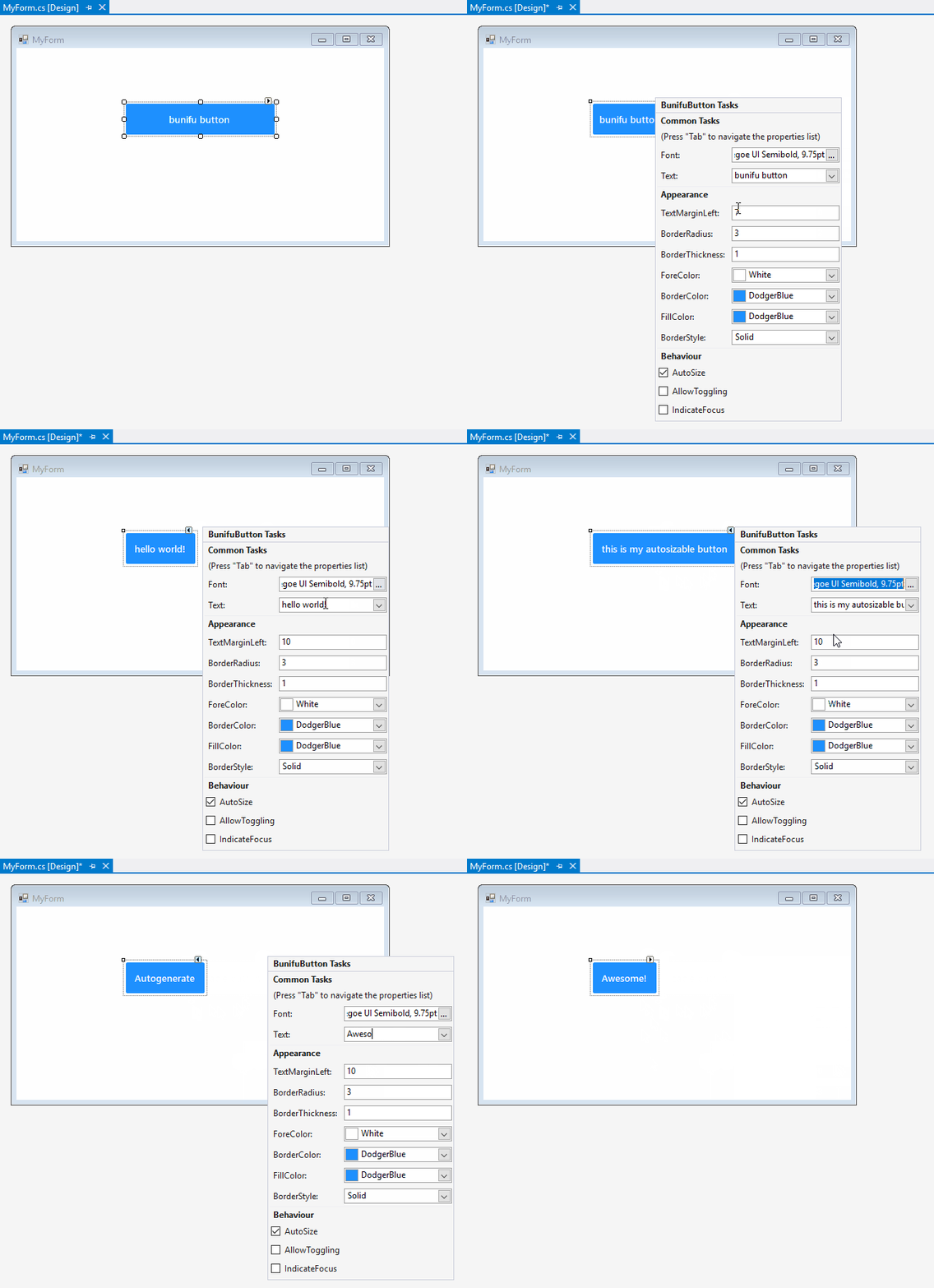
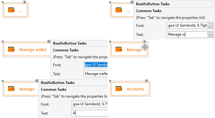
Enabling AutoSize allows the button to automatically resize itself based on its content — both text and icons — so you don't need to manually manage dimensions.
Here the button resizes based on its text content:
The same behavior applies when icons are added:
Toggling Focus
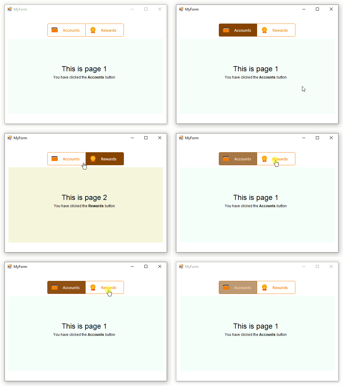
Bunifu Button supports toggle-style focus behavior — useful for grouped buttons acting like tabs, such as when paired with Bunifu Pages.
Example:
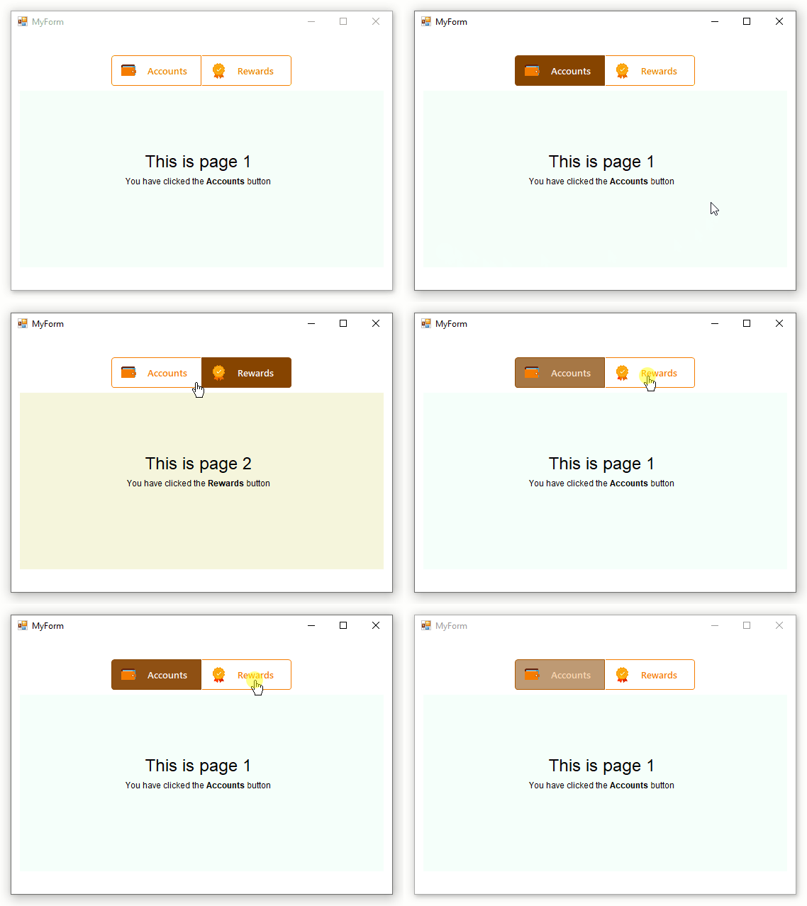
Enable this with AllowToggling. Doing so automatically sets IndicateFocus to true as well, which visually signals the focused button. You can also control which state (Idle, Hover, or Pressed — the default) represents the focused appearance via the FocusState property.
Automatic Color Generation
When AutoGenerateColors is enabled, Bunifu Button automatically derives Hover and Pressed state colors from your base Idle colors (IdleFillColor and IdleBorderColor) — a lighter variant for hover, a darker variant for pressed.
Example:
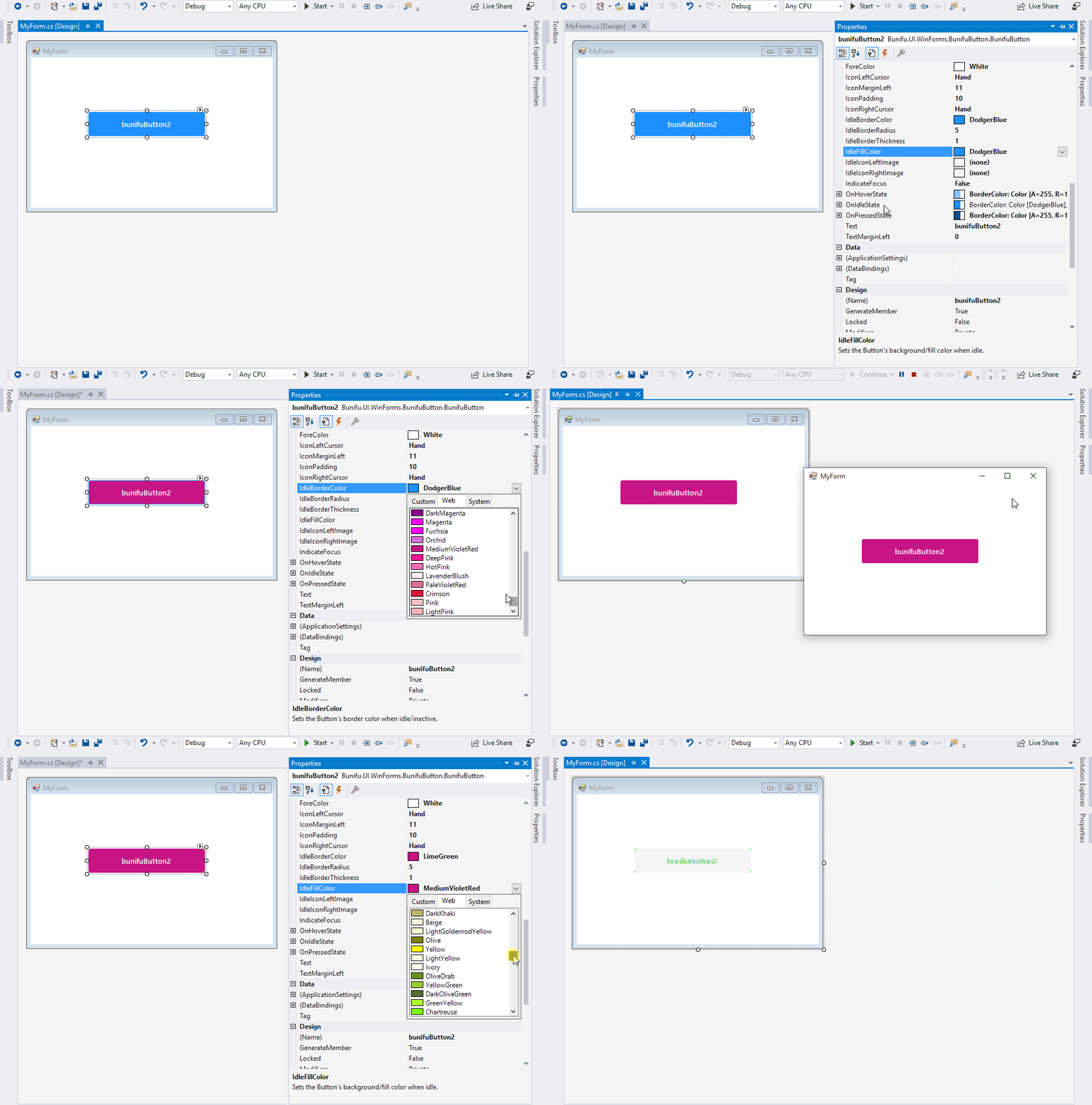
Fine-tune the intensity of these generated shades using ColorContrastOnHover and ColorContrastOnClick (accepting values from 0–100, or negative values to invert which state appears lighter/darker).
Icons
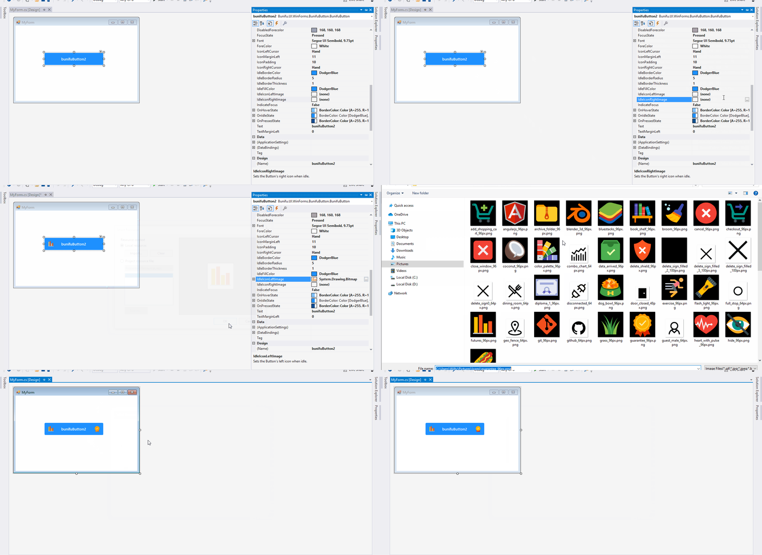
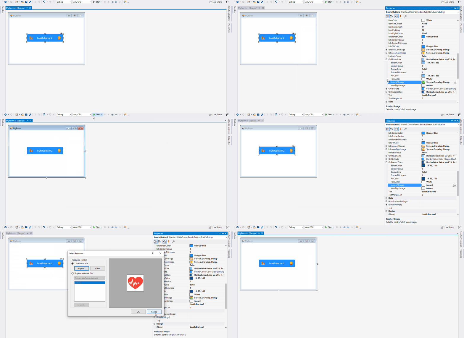
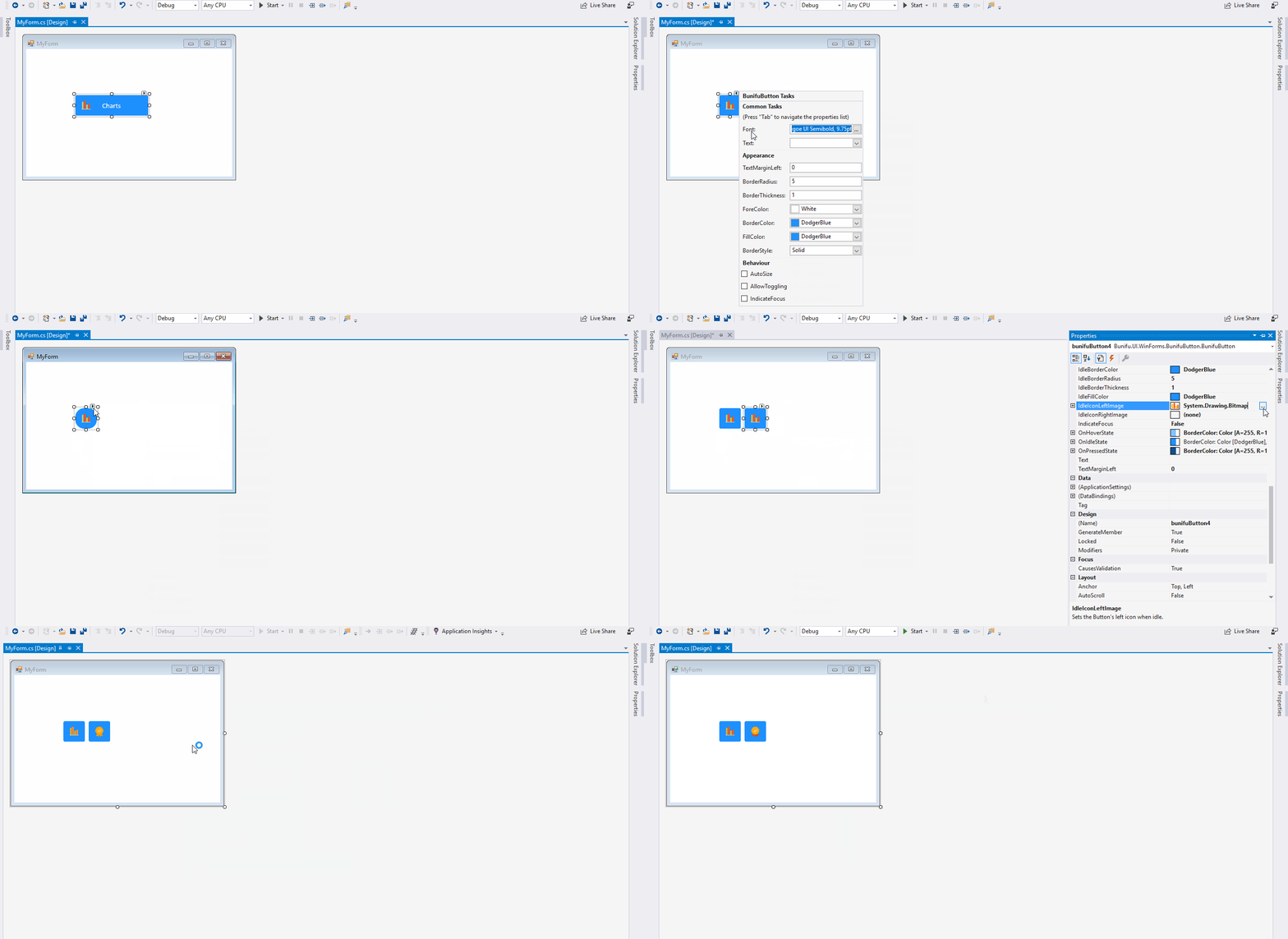
Bunifu Button supports left and right icons via IdleIconLeftImage and IdleIconRightImage, both accepting Image values. These can also be customized separately per state.
- Icon shown only in the Idle state:
- Different icons for Hover and Pressed states:
- Icon-only buttons (no text):
Bunifu Button is one of the framework's foundational controls, designed to give you a strong creative toolkit for building modern interfaces. More features are planned for future releases.